Course banners add a content-based aesthetic that students can see as a glimpse into your course content. To learn more about course images in Blackboard, take a look at the Course Banner article. Below are some best practices to help you develop a course banner for your course.
Refrain from using text in images
Text is not recommended for the course card image. If you use text, center the text both vertically and horizontally in the image. Wrap longer text over multiple lines so the text re-sizes to adjust to different window or mobile device screen sizes. Test the image in multiple views.
Descriptions are required
Please use a description for your image. This description acts as the alternate text read by screen readers making your course banner accessible to all users (especially those using screen readers) in your courses.
Choosing an appropriate image
Select an image that represents your course. Be sure to use an image that is not copyright protected and is free for non-commercial use.
Possible image resources:
Looking for Drake-specific images? Contact the communications manager for your college/school or department to get access to official Drake photos (SmugMug).
Sizing your image
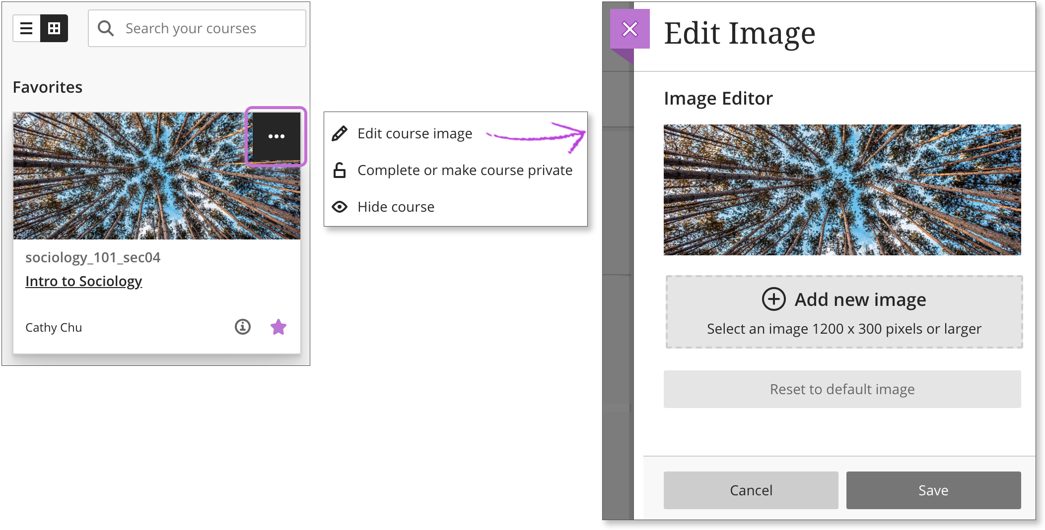
It's best to size your images before you save and add them. Need a good tool for that? Try using Canva.com's free photo editor. The minimum size for images is 1200 x 300 pixels with an aspect ratio of 4:1. Use this measurement to ensure the best quality image.
Adding the image to Learn Ultra
Click on the three dots in the upper-right corner of a course card's image and select Edit course image to add a new image. Be sure to Save.

Making the image the course banner
Course Images can now be used as course banners. Enable the toggle for the Course Image and it will show as a course banner on the course homepage. Include an image description for improved accessibility for those who use screen readers. Be sure to Save.

If you have any further questions, please schedule a consultation through the Blackboard Ultra Request.